Favor HQ Mural

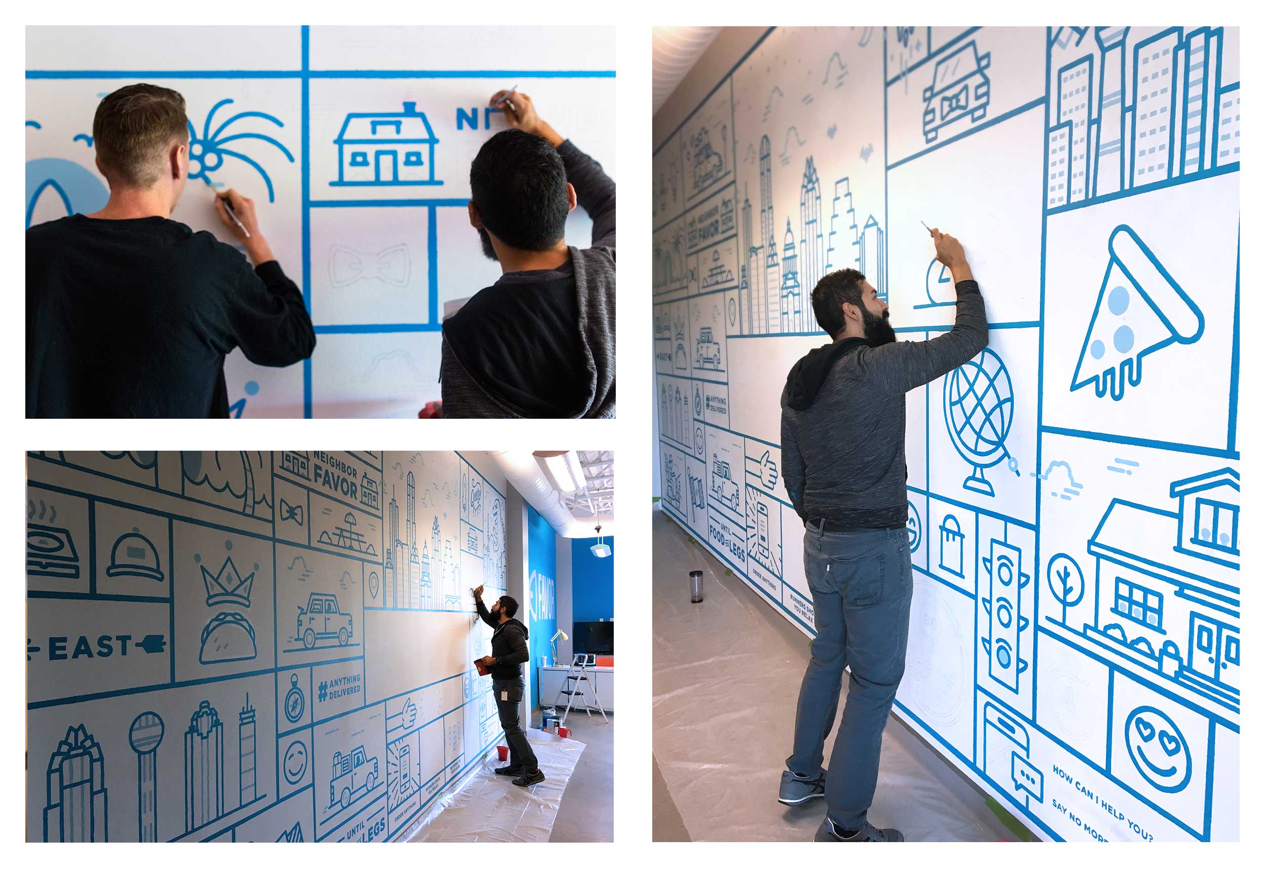
I had never before taken on a mural of this size. So when fellow designer Chris Rogge and I received the word we would be undertaking a 10 x 20 foot mural, we realized we had no idea what we were doing. And so, we were tasked with telling the story of Favor, it’s past, present and future. 

The job was no small one. We needed to create a full-on narrative infographic while working with a young and limited brand illustration style and color palette. Additionally, we needed to capture the essence of the Favor culture - both present and future - which had yet to be fully defined to pen and paper. Outside of taking on the large size of the mural itself, we came to find we would have very limited room to work with in terms of projecting and installing the mural. Finally the mural would need to wrap up within two weeks for the grand opening, while also maintaining a 40 hour work load and designing out other pieces of the HQ office. Let's do this!

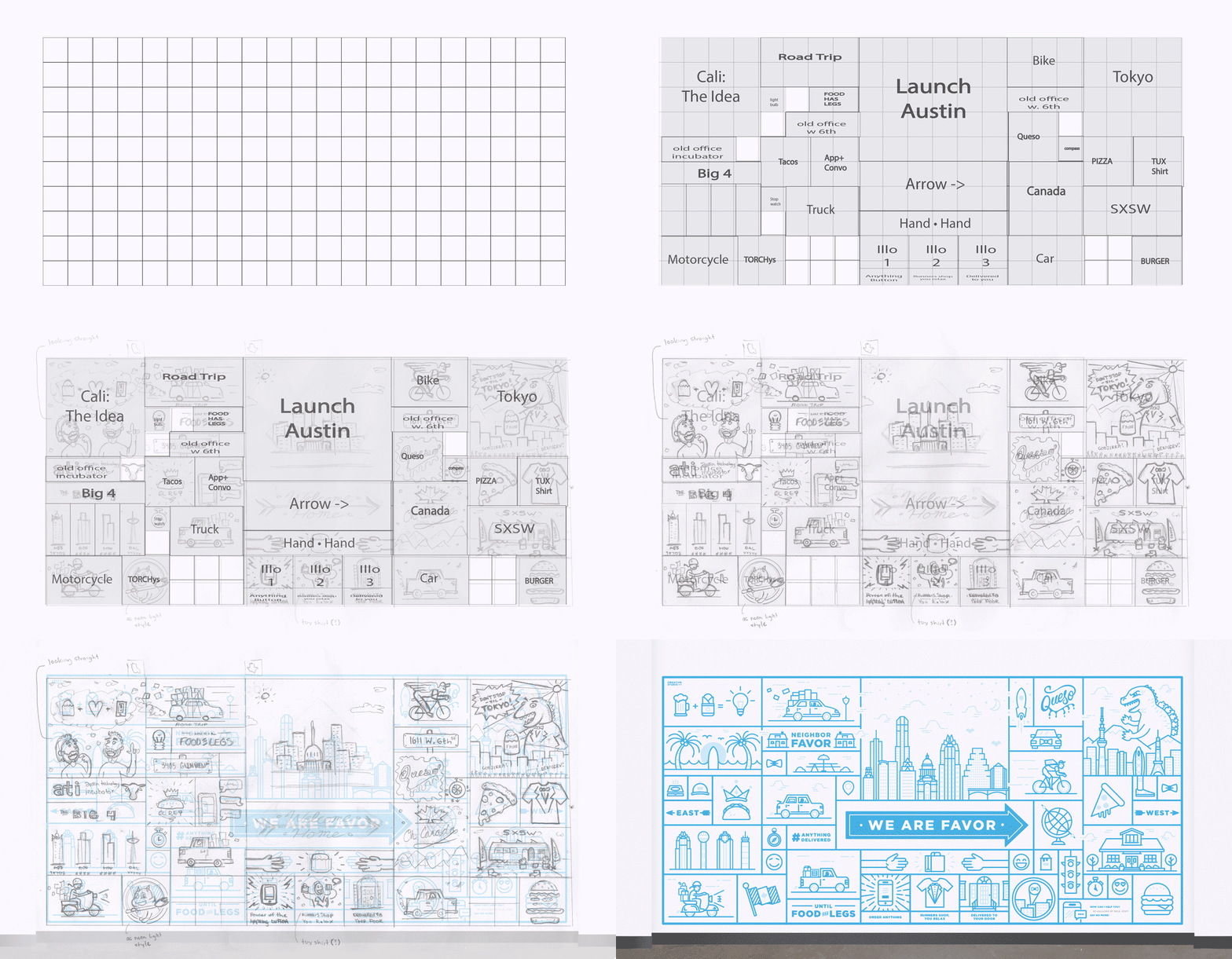
For Chris and I, this was our first project together at Favor. Up until this point we had only worked together for less than a month up to this time. No worries because we killed it. We immediately jumped into action by game planning and asking ourselves tons of questions to find out the things we knew and more importantly, the things we didn't know. We interviewed the owners and stake owners at Favor to get feedback on ideas they’d want expressed. We made countless sketches. We priced out all supplies and came in far under budget. We developed a modular grid system to allow flexibility in the design as we built it. We measured everything dozens of times to make sure our system was correct. We rigged a very modest projection system to help map out our illustration. We primed, we taped off a grid, we drew in paint lines, we painted, we ached, we pushed through, all the while fueled with excitement, free food and caffeine. 

Friends & Contributors

 
ChrisRogge.jpg

Chris Rogge

Truly a hidden gem in the design industry, Chris is an absolute beast! His passion for illustration and design translates directly to the infectious energy he brings to his craft. From a design perspective, he has the formula solved: problem solving + concepts = bad ass illustrations. 

Check him out at roggiedesign.net